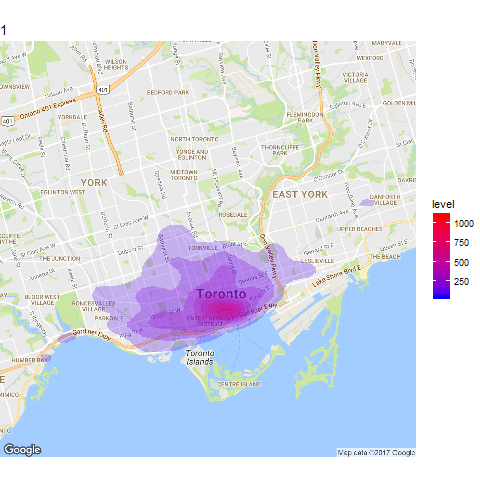
This is a simple example of a shiny app and animation showing 100 hours of Toronto Bike Share usage.
1. Initial Setup
a) Load packages
Install and load the following packages.
library(tidyverse)
library(magrittr)
library(forcats)
library(jsonlite)
library(lubridate)
library(gganimate)
library(stringr)
library(ggmap)
library(shiny)
Optionally, you can add a file.drawer path to permanently save maps once they are downloaded, and avoid repeatedly downloading the same map.
drawer.path <- "path_to_drawer"
b) Download shapshots of the Bike share
To get 100 hours of bike share usage I downloaded and saved a snapshot of the JSON feed on hourly intervals using the code below. To execute the code at hourly intervals I used the taskscheduleR package. For more info on this package see here.
station.locations.raw <- fromJSON("https://tor.publicbikesystem.net/ube/stations")

file.name <- str_c(str_replace_all(now(), "[[:punct:]]|EDT", "_"), "_tor_bike_data.rds")

saveRDS(station.locations.raw, file.path("path_to_data", file.name))
2. Load and clean data
… 100 hours later …
I import, clean and stack all of the JSON data (saved as .rds files) which are now saved in my “path_to_data” directory.
raw.files <- list.files(path_to_data, "rds")


raw.bikes <- raw.files %>%
  file.path(data_path, .) %>%
  map( ~{readRDS(.) %>%
      `[[`(2)}) %>%
  map2(raw.files, ~mutate(.x, file = .y)) %>%
  bind_rows() %>%
  filter(statusKey == 1) %>%
  mutate(datetime = ymd_hms(file),
         station = stationName,
         available.docks = availableDocks,
         available.bikes = availableBikes,
         capacity = available.bikes + available.docks,
         bike.score = available.bikes / capacity,
         lat = latitude,
         lon = longitude) %>%
  select(datetime, station, bike.score, available.bikes, lat, lon)
To create the kernel density we want 1 observation for each bike. To achieve this we create a list column of vectors, and then use unnest.
bikes <- raw.bikes %>%
  rowwise() %>%
  mutate(list.bike = list(1:available.bikes)) %>%
  ungroup() %>%
  unnest() %>%
  mutate(frame = str_c(str_pad(as.numeric(as.factor(datetime)), 3), " - ", wday(datetime, label = T), " - ", hour(datetime)),
         title.date = strftime(datetime, "%A, %B %d at %I %p"),
         title.date = str_replace_all(title.date, "at 0", "at "),
         id = as.numeric(as.factor(datetime)))
3. Create Map Animation
a) Download base map
We can use the ggmap package to get a snapshot of a google map which we will use as our base map. We can customize the style of the google map using the style argument in the get_googlemap() function. You can create the style arguments interactiverly using the Google Maps API styling Wizard.
  # Map Area
  zoom <- 12
  avg.coords <- c(-79.39,43.67)
  options(ggmap.file_drawer =  drawer.path)

  # Map Style
  style <-  "feature:poi.attraction%7Celement:labels%7Cvisibility:off&style=feature:poi.business%7Celement:labels%7Cvisibility:off&style=feature:poi.government%7Celement:labels%7Cvisibility:off&style=feature:poi.medical%7Celement:labels%7Cvisibility:off&style=feature:poi.park%7Celement:labels%7Cvisibility:off&style=feature:poi.place_of_worship%7Celement:labels%7Cvisibility:off&style=feature:poi.school%7Celement:labels%7Cvisibility:off&style=feature:poi.sports_complex%7Celement:labels%7Cvisibility:off&size=480x360"

  # Download Map
  raw.map <- get_googlemap(center = avg.coords,
                         maptype = "roadmap",
                         archiving = T,
                         zoom = zoom,
                         style = style)

  base.map <- ggmap(raw.map)
b) Create density plot and animate
Once we have the base map layer we can add the density plots on top. The frame variable is used to specify the animation
    map_anime <- ggmap(raw.map, extent = "device") +
      stat_density_2d(aes(x = lon, y = lat, group = frame, frame = id,
                          fill = ..level.., alpha=1),
                      data = bikes, geom = "polygon") +
      scale_fill_gradient(low = "blue", high = "red") +
      scale_alpha(range = c(0.00, 0.5), guide = FALSE)
      labs(title = "Hour: ") +
      theme(plot.title = element_text(hjust = 0.5))


    map_animate <- gganimate(map_anime, interval = 0.2)
4. Shiny App
I’ve also put together an very simple shiny app which allows the user to control the animation using a slider.
a) User Interface
ui <- fluidPage(

   # Application title
   fluidRow(
     h4("100 Hours of Toronto Bike Share Usage", align = "center")
   ),

   fluidRow(
     plotOutput("distPlot"), align = "center"
   ),

   fluidRow(
     sliderInput("datetime",
                 "Hour:",
                 min = 1, max = 100,
                 value = 1, step = 1,
                 animate = animationOptions(interval = 500, loop = T)),
      align = "center")

)
server <- function(input, output) {

   output$distPlot <- renderPlot({
      x    <- bikes %>%
        dplyr::filter(id == input$datetime)


      ggmap(raw.map, extent = "device") +
        stat_density_2d(aes(x = lon, y = lat,
                            fill = ..level.., alpha=1),
                        data = x, geom = "polygon") +
        scale_fill_gradient(low = "blue", high = "red", guide = F) +
        scale_alpha(range = c(0.00, 0.5), guide = FALSE) +
        labs(title = x$title.date[1]) +
        theme(plot.title = element_text(hjust = 0.5))

   })
}
To deploy the app
shinyApp(ui = ui, server = server)
Below is the app in action. The hosted app is here.
That’s it!